You can find the Jupyter Notebooks and json files for this project here.
Twitter Classification
After completing the supervised machine learning modules in the Codecademy Data Science track, I went on to tackle the cumulative project: Twitter classification. Unlike my previous project on tennis statistics, which used linear regression to predict yearly winnings, this new project used Naive Bayes and K-Nearest Neighbors models to determine the geographical location of the user and the likelihood of a tweet going viral.
A/S/L?
Coming of age in the late 90’s and early 00’s, I couldn’t have existed on the internet without seeing the popular query, A/S/L (age/sex/location) on a near-daily basis. The first half of the Twitter classification project set out to tackle the “L” part of that popular query:
Based on the words used in a tweet, is it possible to accurately predict the nationality of its author?
I was given three datasets from three different cities: New York, London, and Paris. Each dataset contained a host of data about individual tweets, but for the sake of the project I was primarily concerned with the text they contained.
The Setup
In order to create usable data from each dataset, I needed to utilize scikit-learn’s CountVectorizer function. This function creates a list for every single unique word in the dataset. Calling its transform method changes a string or list of strings into a list that counts how many times each word was used.
from sklearn.feature_extraction.text import CountVectorizer

counter = CountVectorizer()
counter.fit(train_data)
train_counts = counter.transform(train_data)
test_counts = counter.transform(test_data)

print(train_data[3], train_counts[3])
This code block created word counts for each string in both the training and test data. To test it out, I printed the tweet and word counts at index 3 of my training data.
saying bye is hard. Especially when youre saying bye to comfort.
| List Index | Word Count |
| (0,5022) | 2 |
| (0,6371) | 1 |
| (0,9552) | 1 |
| (0,12314) | 1 |
| (0,13903) | 1 |
| (0,23994) | 2 |
| (0,27146) | 1 |
| (0.29397) | 1 |
| (0,30274) | 1 |
The tweet, “saying bye is hard. Especially when youre saying bye to comfort,” contains nine unique words. “Saying” and “bye” were both used twice, which is shown at the train_counts list indexes (0,5022) and (0,23994). The other seven words were all used once. Every other word in our three datasets was left unused and would have returned a count of 0 at that index.
Naive Bayes
Bayes’ theorem determines the probability, P, of something being true given related data. In this instance, I attempted to use a Naive Bayes model to determine whether a tweet originated from New York, London, or Paris, based off of a list of words used and their frequency in Twitter data from each city.
\[P(city|tweet) = \frac{P(tweet|city) * P(city)}{P(tweet)}\]Scikit-learn’s handy MultinomialNB function did all of the work for me. Just like with the CountVectorizer function, I needed to import the function from the scikit-learn library, create the model, and fit it to my data. Once that was done, I used it to predict the cities that each tweet in my test data originated from.
from sklearn.naive_bayes import MultinomialNB

classifier = MultinomialNB()
classifier.fit(train_counts, train_labels)
predictions = classifier.predict(test_counts)
When I called the accuracy score on my model, it only reported an accuracy of 67.8%. I was unsurprised, especially considering that two out of three of my datasets were in English-speaking countries. To get a better idea of how well the model predicted, I compared the predictions to their actual data using a confusion matrix.
| Prediction: NYC | Prediction: London | Prediction: Paris | |
| Actual: NYC | 541 | 404 | 28 |
| Actual: London | 203 | 824 | 34 |
| Actual: Paris | 38 | 103 | 340 |
The model was definitely better at predicting tweets from Paris than London or New York. The model struggled to differentiate between tweets from London and New York, though.
Testing the model
To test my model, I wrote two different tweets. The first, “I’m still working on learning Data Science, but this is the end of my supervised learning lessons,” was classified as being from London. The second, written in French– which I am incredibly rusty at–, said, “Je suis une etudiante de science des donnees,” and was classified as being from Paris. Following my findings from the above confusion matrix, these predictions make perfect sense.
Call the WHO because that tweet is viral
The second half of the Twitter classification project was to determine whether a tweet would become viral. To do this, I made use of a K-Nearest Neighbors model. Before I could do that, though, I needed to collect some relevant data.
The Setup
The provided dataset, random_tweets.json, contained a lot of information. Within the dataframe I imported, the columns were titled as follows:
- created_at
- id
- id_str
- text
- truncated
- entities
- metadata
- source
- in_reply_to_status_id
- in_reply_to_status_id_str
- in_reply_to_user_id
- in_reply_to_user_id_str
- in_reply_to_screen_name
- user
- geo
- coordinates
- place
- contributors
- retweeted_status
- is_quote_status
- retweet_count
- favorite_count
- favorited
- retweeted
- lang
- possibly_sensitive
- quoted_status_id
- quoted_status_id_str
- extended_entities
- quoted_status
- withheld_in_countries
Within the user column, each tweet contained a dictionary of even more information!
- id
- id_str
- name
- screen_name
- location
- description
- url
- entities
- protected
- followers_count
- friends_count
- listed_count
- created_at
- favourites_count
- utc_offset
- time_zone
- geo_enabled
- verified
- statuses_count
- lang
- contributors_enabled
- is_translator
- is_translation_enabled
- profile_background_color
- profile_background_image_url
- profile_background_image_irl_https
- profile_background_tile
- profile_image_url
- profile_image_url_https
- profile_banner_url
- profile_link_color
- profile_sidebar_border_color
- profile_sidebar_fill_color
- profile_text_color
- profile_use_background_image
- has_extended_profile
- default_profile
- default_profile_image
- following
- follow_request_sent
- notifications
- translator_type
Like I said: a LOT of information. The likelihood that I needed all of that just to determine if each tweet was pretty slim. Besides, using everything would run the risk of the model executing incredibly slowly and overfitting the model to the training data, which would decrease its accuracy.
Since I wanted to determine whether or not a tweet would go viral, I set up the labels, or outcome of each tweet, to be a binary classifier of whether the tweet was above the 90th percentile for retweet count.
import numpy as np
all_tweets['is_viral'] = np.where(all_tweets['retweet_count'] > np.quantile(all_tweets['retweet_count'], 0.90), 1, 0)
The data I chose went a little bit above and beyond what Codecademy wanted. They had asked for the tweet length, the user’s follower count, and the user’s friend count. I selected all of those things, as well as the number of hashtags, the number of links, whether the user was a verified user, and whether the tweet was part of a series– that is, if the user had responded to themself. To create a column on my table for each of these fields, I made liberal use of lambda functions:
all_tweets['tweet_length'] = all_tweets.apply(lambda tweet: len(tweet['text']), axis=1)
all_tweets['followers_count'] = all_tweets.apply(lambda tweet: tweet['user']['followers_count'], axis=1)
all_tweets['friends_count'] = all_tweets.apply(lambda tweet: tweet['user']['friends_count'], axis=1)
all_tweets['hashtags'] = all_tweets.apply(lambda tweet: tweet['text'].count('#'), axis=1)
all_tweets['links'] = all_tweets.apply(lambda tweet: tweet['text'].count('http'), axis=1)
all_tweets['verified_user'] = all_tweets.apply(lambda tweet: 1 if tweet['user']['verified'] else 0, axis=1)
all_tweets['series'] = all_tweets.apply(lambda tweet: 1 if tweet['in_reply_to_user_id'] == tweet['user']['id'] else 0, axis=1)
Then, I assigned each of the above columns to either the labels (output) or data (input) and normalized, or weighted it.
from sklearn.preprocessing import scale

labels = all_tweets['is_viral']
data = all_tweets[['tweet_length', 'followers_count', 'friends_count', 'hashtags', 'links', 'verified_user', 'series']]
scaled_data = scale(data, axis=0)
After that, all I had to do was split the data for training and testing and create my model!
K-Nearest Neighbors
If you aren’t incredible mathy, it can be hard to imagine a graph with more than two or three dimensions, let alone an abstract, n-dimensional one. Nevertheless, that’s exactly what you’re creating when creating a K-Nearest Neighbors model. Each dimension contains a parameter from the input data. By filling out the coordinates of each dimension, you are left with a single point. Do it for every piece of data and you have a whole set of points scattered over your n dimensions. Each point also has a label, or its expected output. If you had a point with no label, you could examine the labels of the points nearest to it to make a well-educated guess about what it could be.
And that’s how I used my computer and the above data to determine whether a tweet would go viral or not.
Now, you don’t really need to know all of the math behind K-Nearest neighbors (even though it’s very fun) because scikit-learn is here to save the day again. This time, though, I created a loop to find the optimal number of neighbors to examine when determining whether a tweet would go viral.
from sklearn.neighbors import KNeighborsClassifier

scores = []
best_score = 0
best_k = 0

for k in range(1,200):
  classifier = KNeighborsClassifier(n_neighbors=k)
  classifier.fit(train_data, train_labels)
  score = classifier.score(test_data, test_labels)
  scores.append(score)
  if score > best_score:
    best_score = score
    best_k = k

plt.plot(range(1,200), scores)
plt.title('Model Accuracy for K values 1-200')
plt.xlabel('K Value')
plt.yllabel('Accuracy')
plt.savefig('model_accuracy.png')
plt.show()
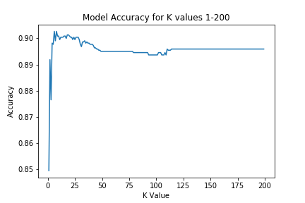
Based off of the scores generated by my for loop, the optimal number of neighbors to examine was six, with an accuracy score of 90.27%. Any more neighbors and the model would have suffered from overfitting and lost between 0.5 and 1 percentage points.
There you have it! By examining a user’s followers, friends, and their verified status as well as the individual tweet’s length, hashtags, links, and whether it was in a series, this model can predict with 90.27% accuracy if the tweet will be above the 90th percentile for retweets. That’s pretty viral!