You can find the Jupyter Notebook for this project here.
Tennis Ace
Let’s be real. I don’t have a single athletic bone in my body. So, when I was given an open-ended project on Codecademy to analyze a tennis statistics dataset using linear regression, I can safely say that my prior knowledge consisted of:
- There’s a ball and a net.
- Serena and Venus Williams are famous tennis players.
- Paul Bettany played a tennis player in the 2004 movie Wimbledon, which I watched a few times in high school and hadn’t thought of since.
When I inspected my columns, I felt lost in a sea of break points and first serves… What does it all mean? Determined to make something of the data, I read up on each statistic.
First Serves, Second Serves, and Aces
A serve in tennis is the initial shot to start a point. The first serve is exactly what you would think: the first attempt at getting the ball over the net. If that attempt fails, or results in a fault for one of the following reasons, the server attempts again as the second serve:
- The ball bounces in the wrong spot or hits something that it shouldn’t, like the net
- The server is in an illegal position
- The server misses the ball entirely
If the serve goes over the net into the court and the receiver is unable to hit it, that is called an ace. The server gets a point and gets to serve again.
Break Points
If a player is one point away from winning the game and their opponent is serving, this is considered a break point opportunity. If the player gains a point, thus winning, they converted a break point.
On the other hand, the server in this scenario is one point away from losing; they are facing a break point. If they were to gain a point and keep the game going, it would be considered a break point saved.
The Data
The dataset I analyzed contained 1,721 entries, spread out over the years 2009-2017. After an exploratory analysis, I decided to explore how winnings changed over the years.
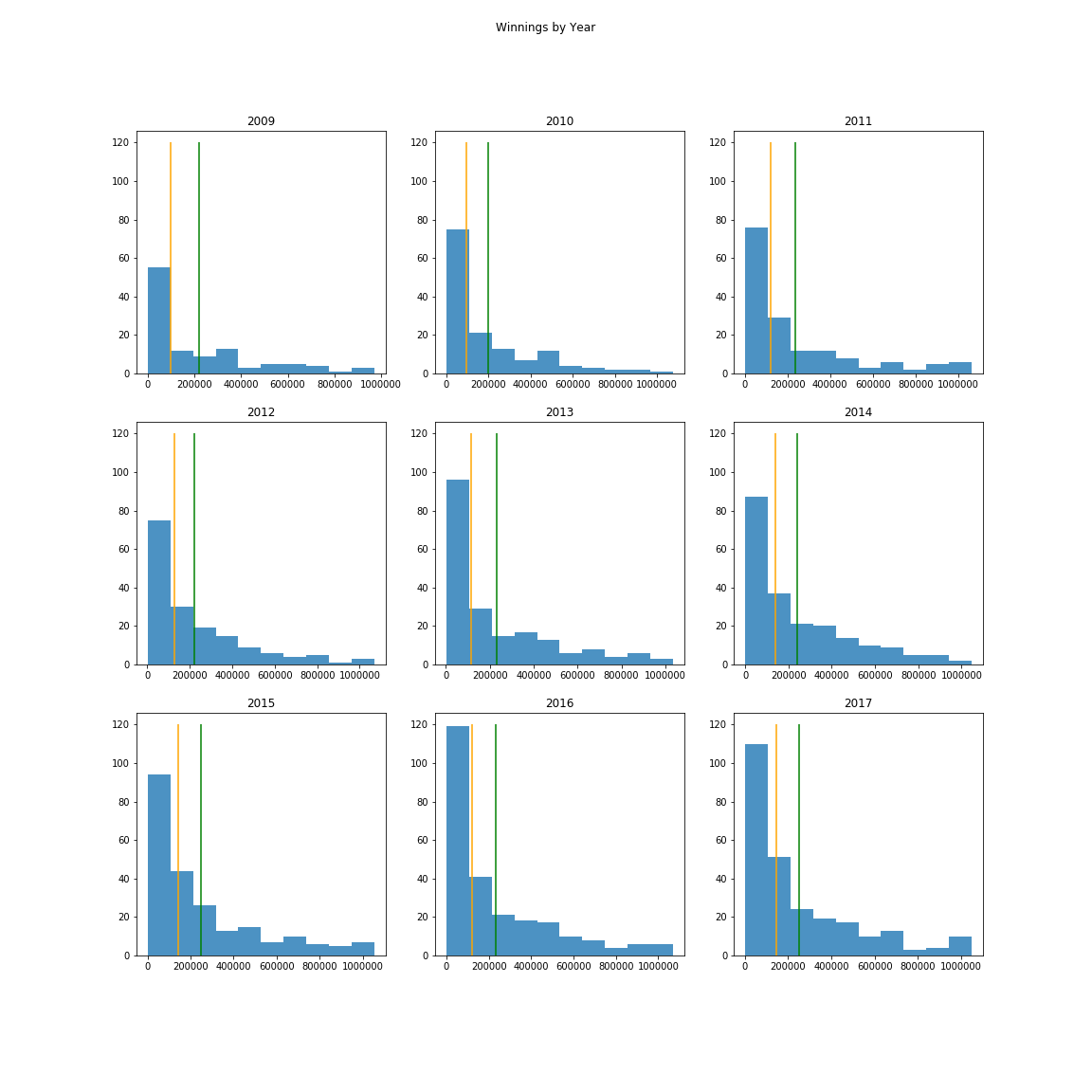
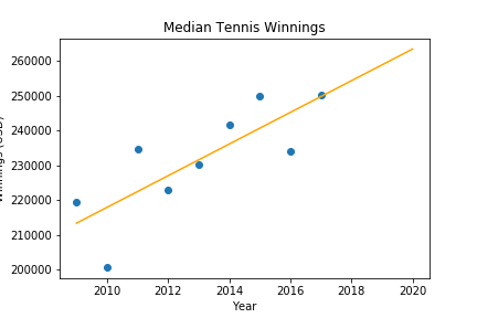
The median yearly winnings– the orange line on each graph– seemed more representative of each year’s winnings. So, I used the median yearly winnings to predict median winnings in subsequent years. If we weren’t in the middle of a global pandemic, median tennis player winnings would be $263,000 this year!
Break Points
If you’re like me, my scatterplots about break points have you sitting on the edge of your seat and holding your breath the same way that a tennis fan does when watching an actual break point. I mean, look at all of that information!
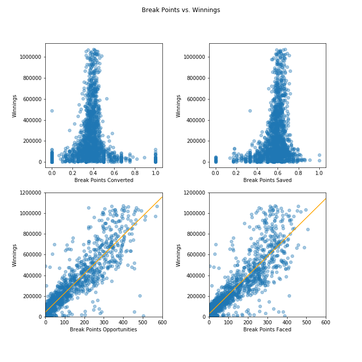
We can already tell that more break points opportunities and break points faced mean more winnings. Higher numbers of break points opportunities translated to about $15,500-17,000 more yearly winnings than their underdog counterparts, but both sets of players had the potential to win a lot of money.
We can also see that very few tennis players converted or saved 100% of their break points. They were actually more likely to win more if they converted around 40% and saved around 60% of break points. Judging by this, you can make one of two (or both!) assumptions:
- Tennis players who played more games, thus facing more break points, were more likely to earn more money.
- Because the typical break point converted/saved split was roughly 40/60% and it showed significantly more potential for higher winnings, tennis players who played longer games with more break points had a tendency to make more money.
First Serves
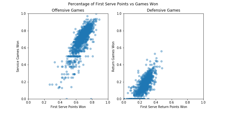
I wanted to know if first serves generally affected the outcome of games, and if that translated to better rankings and winnings. Tennis players with a higher percent of first serve points won won more games, with players that earned 80% of their first serve points winning nearly all of their service games. Players earning first serve return points, however, were much less likely to win a large portion of return games, even though more first serve return points did translate to better performance.
Predictions
With the understanding that a better ranking, more break points opportunities (on both sides), and more first serve and first serve return points won meant more winnings, and that winnings increased as time went on, I was able to train a model to predict yearly winnings. With an 84% accuracy, it’s pretty accurate!
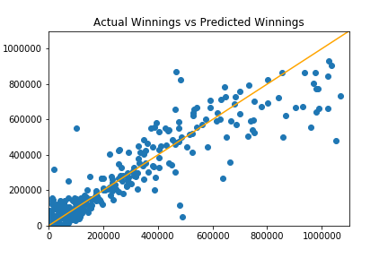
Throughout my analysis, I found that many of the higher-earning tennis players tended to be outliers in other categories, which would explain why the model had difficulty predicting higher winnings.
For fun, I decided to use my model to predict what I could win in a year of playing tennis. I’m being optimistic that we might have a vaccine next year, which would hypothetically give me time to practice my serve. Based on my athletic aptitude, I placed myself below the worst-ranked tennis player in my data: Rhyne Williams. That poor guy just couldn’t catch a break! I also assumed that even if I practiced day and night until the next tournament, I still wouldn’t stand much of a chance against a professional athelete. These are the fields I input into the model:
| Year | 2021 |
| Ranking | 1444 |
| BreakPointsOpportunities | 0 |
| BreakPointsFaced | 6 |
| FirstServePointsWon | 0.16 |
| FirstServeReturnPointsWon | 0 |
Mind you, these stats are abysmal. I honestly expected to come up in the negative, but would you believe that I would win around $4,600 with something like this? Of course, that’s yearly winnings and it doesn’t take into account entry fees, uniforms, travel, and equipment.
Maybe I’m better off sticking to data science.